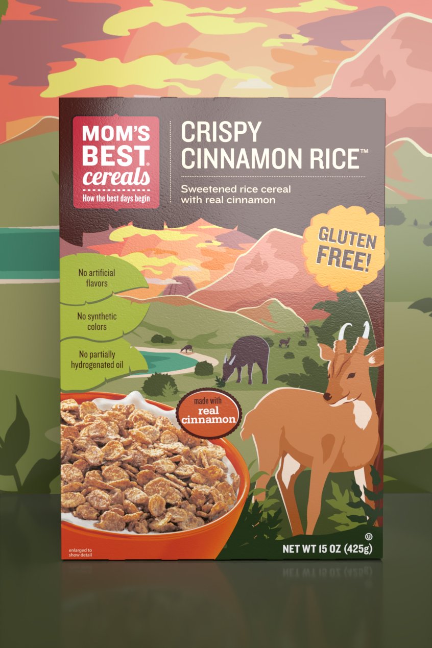


Mom’s Best Cereals kids packaging
illustration, packaging system, keylining
Packaging refresh for the brand’s main line of cereals. The increased color vibrancy helps shelf visibility & creates a strong billboard effect. The soft gradients add just the right amount of modern touch. The new illustrations share the simple message to enjoy life’s moments, big or small & encourage you to make the most of your upcoming day.
other roles / Ariel Hung, Kate Carlson, Danielle Tournquist, Lindsey Bennett
role / designer
agency / ideas that kick
CASE STUDY
the Mom’s Best kid line needed an updated illustration look that was fun, unique & engaging. Each box should showcase its own personality yet fit within the family of flavors.
Detail of the vector illustrations vs final artwork
Keylined artwork
the solution /
developed illustrations for 4 kids boxes that are both eye-catching & educational. Each flavor depicts a different world region & fun facts related to the geography are integrated into the landscapes. The level of detail allows the user to sit with the box multiple times over & still find something new to find.


