
Mom’s Best Cereals
illustration, packaging system, keylining
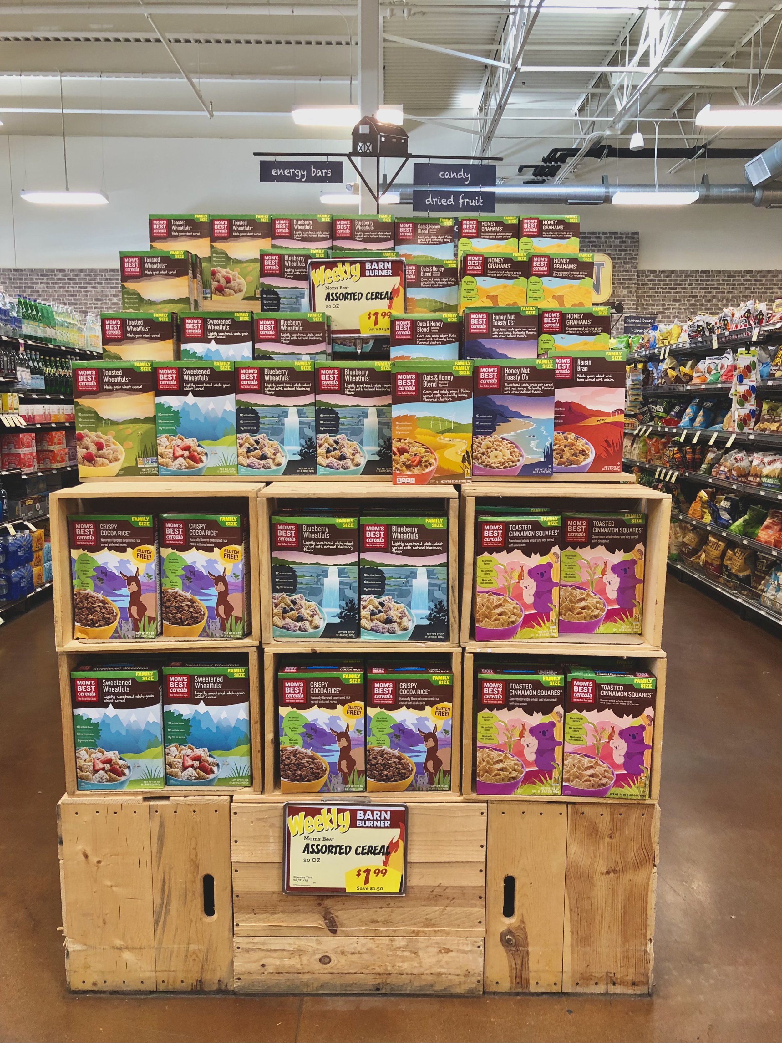
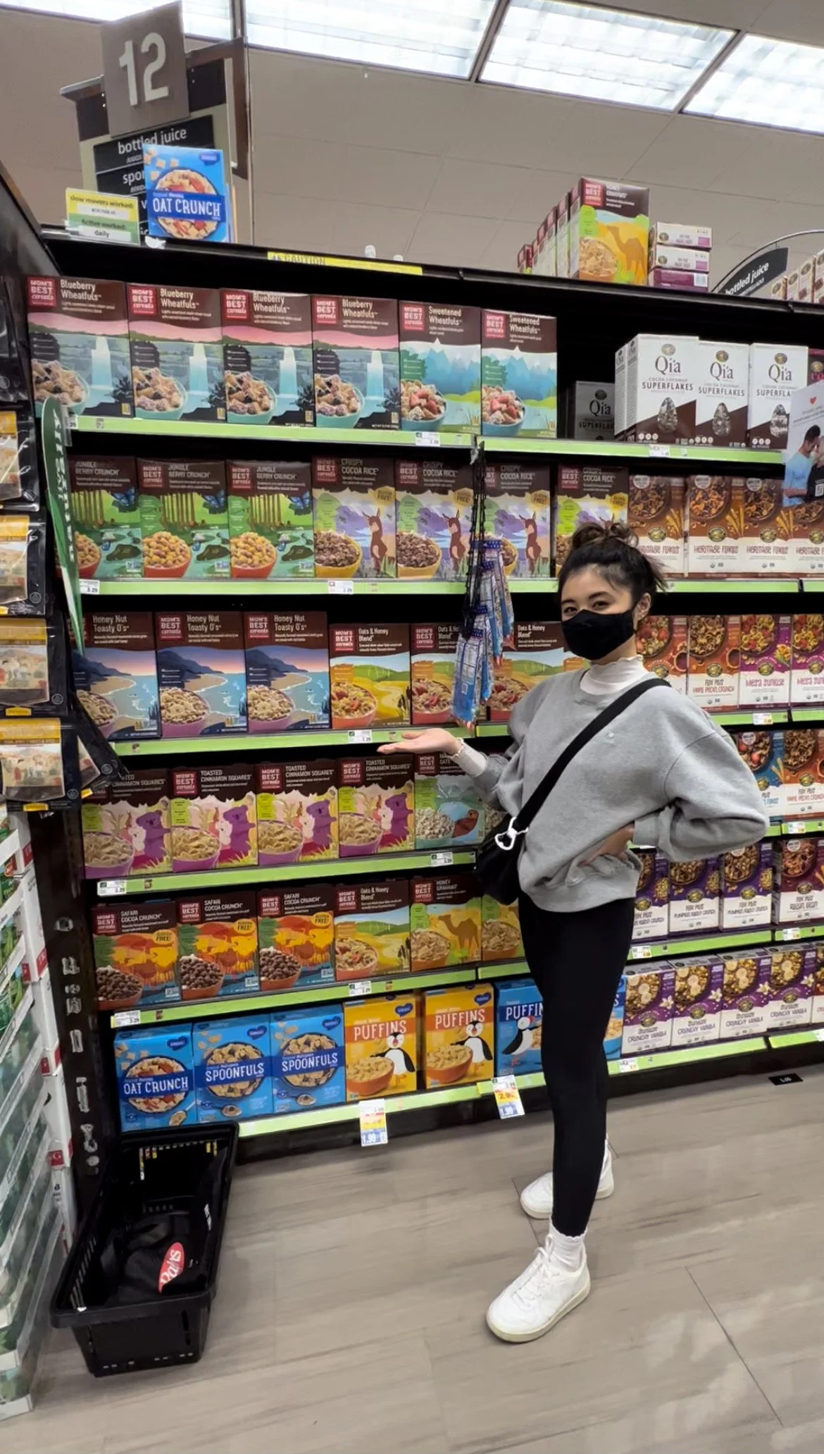
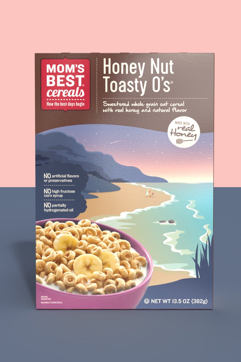
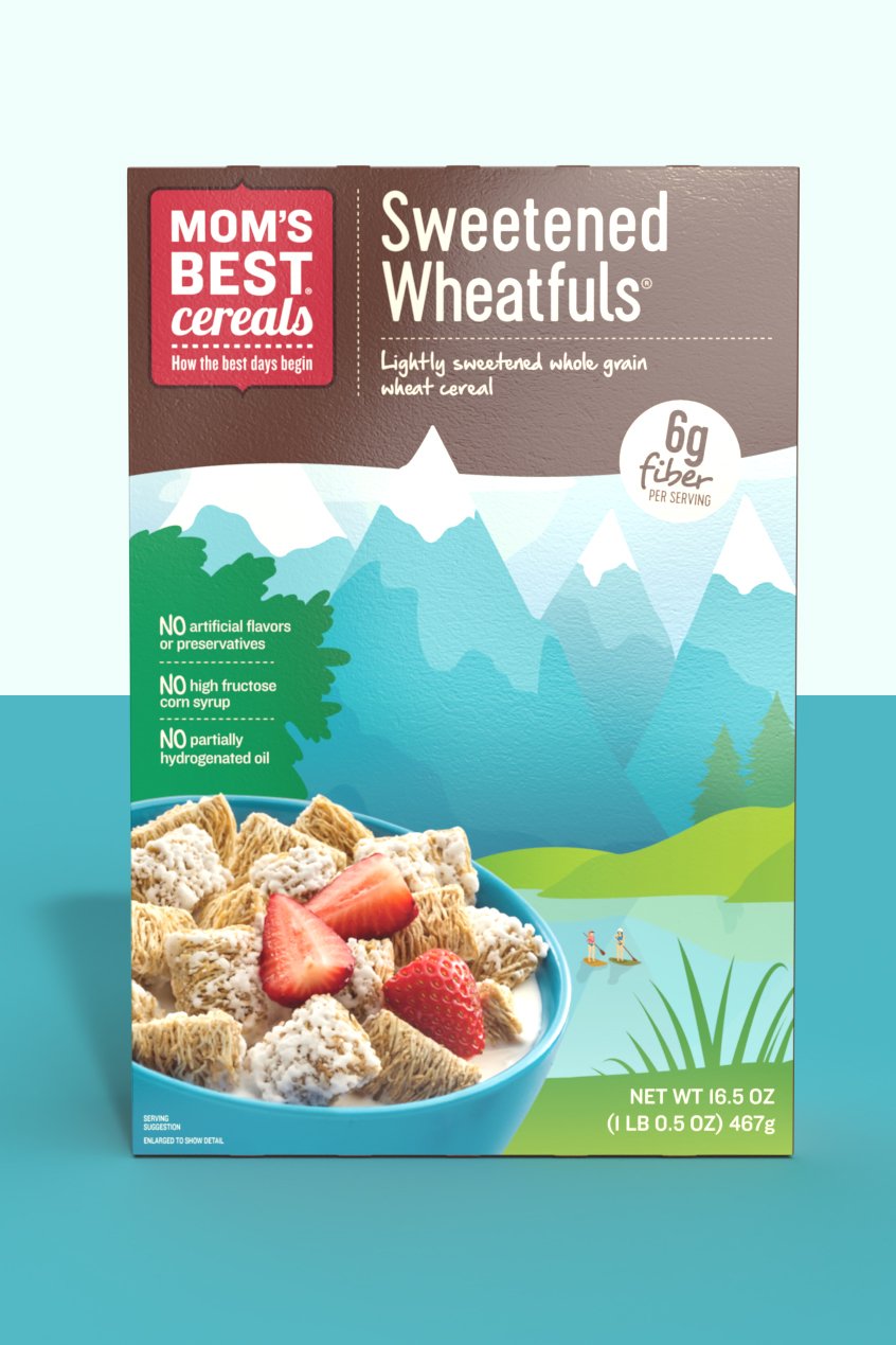
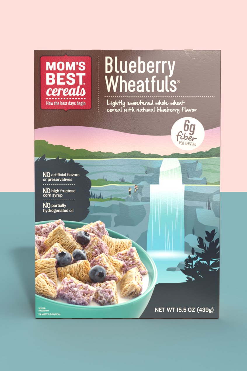
Packaging refresh for the brand’s main line of cereals. The increased color vibrancy helps shelf visibility & creates a strong billboard effect. The soft gradients add just the right amount of modern touch. The new illustrations share the simple message to enjoy life’s moments, big or small & encourage you to make the most of your upcoming day.
role / designer
agency / ideas that kick
CASE STUDY
This category has become a crowded space with the rising interest in natural & organic foods. But being “natural” is merely the cost of entry. Mom’s Best Cereals needed positioning & design to help differentiate them on shelf.
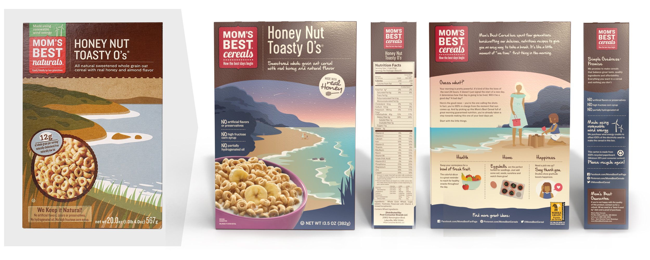
Starting with the existing designs, the refresh pushes the brand beyond the expected “natural” with modern gradients & the inclusion of people illustrations enjoying the simple things in life.
Mom’s Best Cereals finds itself as a value option for established natural & organic buyers & an aspirational brand for not-yet-natural shoppers.
the solution /
A family of cereal box packaging designs (6 total) that showcase the Mom’s Best emphasis on aspirations through illustration & copy. It connects with the audience using the brand’s relatable & honest view on natural eating as manageable, incremental changes—not an all-or-nothing endeavor.
In a world of curated perfection, room needs to be made for authenticity.
Each package owns color scheme, yet plays well as a set. The back panels include fun lifestyle “hacks” that follow Mom’s Best’s pillars: health, home & happiness. My involvement began as early as layout sketches & continued through preparing the dielines for print.
I also illustrated many boxes for the MOM’s Best Kids line! You can check it out here.

